Designing the Launch Experience for “Zero Hour” – A Cinematic Gaming Website
- Radishan Yahathugoda
- Apr 1, 2025
- 2 min read

Updated: Jul 14, 2025
Designing the Launch Experience for “Zero Hour” – A Cinematic Gaming Website
Project Introduction
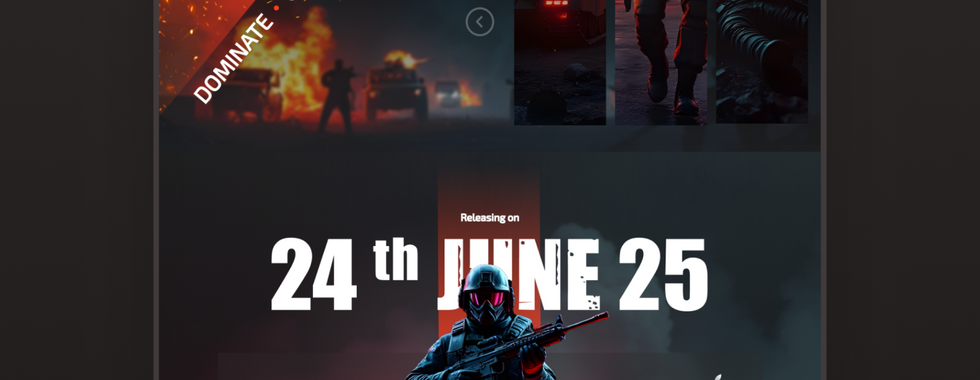
One of the most exciting projects I recently worked on was designing the landing page for Zero Hour — a new tactical first-person shooter set in a high-intensity urban warfare environment. The challenge was to create a web experience that not only captures the gritty atmosphere of the game but also guides users effortlessly toward key actions like pre-ordering, watching the trailer, and joining the player community.
This project allowed me to combine storytelling, visual design, and user-centered thinking into one immersive experience.
Goals & Creative Direction
The main goal was to build early excitement and anticipation for the game’s release while keeping the design both visually engaging and functionally clear. Key priorities included:
Creating a bold first impression that reflects the game’s tone.
Promoting key features such as Realistic Gameplay, Single & Multiplayer Modes.
Highlighting the release date and platform availability (Xbox, PS5, Windows, macOS).
Encouraging users to pre-order or join the community through strong CTAs.
Visual Style & Design Choices
The visual direction was heavily inspired by the game’s themes — chaos, tension, and combat. I used a dark cinematic palette contrasted with bursts of fire and glowing red accents to recreate the atmosphere of a city under siege.
Some standout design decisions include:
A high-impact hero section featuring a central character, bold title, and CTA.
Diagonal layout breaks to create a sense of movement and energy throughout the scroll.
Integration of game visuals and a trailer preview to build immersion.
Rugged, impactful typography that echoes the military theme.
User Experience Strategy
While the visuals set the tone, UX decisions ensured the site was easy to navigate and conversion-focused. Here's what I focused on:
Clear and repeated pre-order buttons to drive conversions.
A strong visual emphasis on the release date to build anticipation.
Smooth content hierarchy with feature highlights and gameplay previews.
Community links for early engagement and social buzz.
Fully responsive design for seamless viewing across devices.
What I’m Proud Of
A layout that balances cinematic flair with usability
A storytelling flow that reflects the gameplay experience
Scalable design sections ready for future content (news, updates, etc.)
A design that feels as immersive as the game itself
Final Thoughts
Designing the website for Zero Hour was more than just a creative task — it was an opportunity to step into the mindset of the game’s players and build an interface that speaks their language. From the bold visuals to the intuitive user flow, this project challenged me to deliver a launch experience that feels as intense as the game itself.
If you're interested in seeing more of my work or collaborating, feel free to reach out — I’d love to connect.


Comments